Women’s Javascript Study Group, sponsored by Zoosk

There are lots and lots of women who code; but in any given room at any company, there are usually only a few of us…. So it’s nice to get together sometimes! Zoosk is sponsoring a Women’s Javascript Study Group run by two of us on the Zoosk UI Dev team (me & Kristin). It will give us all a chance to improve our JS skills (we specialize in HTML & CSS), and allow us to encourage women who are just getting started.

Our general format is that we’ll all eat dinner together (thanks, Zoosk!), and then one woman will give a casual 15-minute presentation on some front-end tip or trick, could be Javascript, HTML, or CSS. Afterwards, we’ll spend a couple hours on JS tutorials. We’re currently using Code Academy, but might try other sites, too. When one person gets stuck, we can pitch in to help, or if someone has a side project they need any front-end help with, we can do that too.

I’m proud to work at a company that not only values employee training, but also community outreach and support of women in technology.  So… if you or anyone you know is a woman who’d like to learn Javascript or improve her skills, come join us tonight or any other Wednesday evening!

Mobile Web Design: Use HTML5 to trigger the appropriate keyboard for form inputs

Both iOs (iPhone / iPod / iPad) and Android devices offer specialized keyboards for entering different types of text input. Triggering the most appropriate keyboard for the type of input you want users to enter will greatly enhance their user experience.

Types of Keyboards:

  • Default: Alphabetic with toggle button to display full numeric keyboard
  • Numeric: Same as default but displays full numeric keypad initially
  • Email: Like default but contains specialized keys for entering email addresses
  • URL: Like default but contains specialized keys for entering URLs
  • Number Pad / Phone: Simplified numeric keyboard

HTML5 for Triggering Keyboards

Using regular HTML text inputs will just trigger the default keyboard:
<input type=”text”> = Default keyboard

HTML5 introduces new input types which can be used to trigger the other more specialized keyboard types automatically. iOS offers better support than Android for these in general. However, since the default type for the HTML input tag is “text”, browsers which don’t understand a particular input type will simply fall back to interpreting it as “text” and will therefore just display the default keyboard. This means you can safely start using HTML5 input types now to enhance the user experience in browsers which support them without worry of breaking functionality in browsers which don’t.

Trigger Email & URL Keyboards:
Email: <input type=”email”>
URL: <input type=”url”>

Triggering Numeric Keyboards

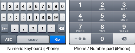
There are two types of numeric keyboards. The “Number Pad” or “Phone” keyboard contains large numbers with no option for entering letters. The full numeric keyboard is actually the same as the default alphabetic keyboard except the numeric keys are displayed in the initial view.

There are different ways to trigger these numeric keyboards. Which you should use depends on the type of numeric input you require users to enter.
For telephone numbers:
<input type=”tel”>

For quantities:
<input type=”number”>

On iOS, “number” brings up the default keyboard but already switched to number, while “tel” displays the number pad / phone keyboard. On Android, both “number” and “tel” bring up a number pad keyboard. (The Phone/Number Pad keyboard is generally easier to use than the regular numeric keyboard due to the much larger touch targets which is another factor to keep in mind when selecting which input type to use.)

IMPORTANT: In some browsers, input type=”number” renders controls for incrementing numbers up and down. For this reason, number inputs should only be used for quantities, not for numeric strings such as zip codes.

The HTML5 “pattern” Attribute

So since “tel” inputs are really only appropriate semantically for telephone numbers and “number” inputs are interpreted by browsers as quantities, what should you use for numeric strings like credit card numbers and zip codes? The answer is to just use a “text” input which is meant for entering strings. However, in order to display a numeric keyboard instead of just the default keyboard you must make use of another new HTML5 attribute called “pattern”.

The pattern attribute allows you to add regular expressions for pattern matching. This enables you to specify only certain specific types of text input a form element will accept. If you specify that an input should only accept numbers, then in iOS at least, the numeric view of the default keyboard will be triggered for users.

Examples Using Pattern Attribute:
<input type=”text” pattern=”[0-9]*”>
<input type=”text” pattern=”\d*”>

From Apple’s documentation:
“To display a numeric keyboard, set the value of the pattern attribute to “[0-9]*” or “\d*”.”


References:
Text, Web, and Editing Programming Guide for iOS: Managing the Keyboard
http://developer.apple.com/library/ios/#documentation/StringsTextFonts/Conceptual/TextAndWebiPhoneOS/KeyboardManagement/KeyboardManagement.html
(Caution: contains incorrect html in example code)

HTML5 Input Type Keyboards on iPhone & Android Devices
http://www.petefreitag.com/item/768.cfm

The Pattern Attribute
http://www.whatwg.org/specs/web-apps/current-work/multipage/common-input-element-attributes.html#the-pattern-attribute

Regular Expression Quick Start
http://www.regular-expressions.info/quickstart.html

Smart wrapping: <wbr> vs zero-width space

French text wrapped poorly

Before <wbr>

One of my French colleagues came to me with a wrapping issue — “Montrez-vous” was breaking at the hyphen in Chrome, but not in Firefox.  The CSS hack would have been to make the font-size larger, so the browser broke the word at the right place…. but then a colleague alerted me to the <wbr> tag. According to the HTML5 spec, the wbr element “represents a line break opportunity”. This is a great tool for us at Zoosk, as we translate our site in dozens of languages — and French is certainly more verbose than English (and Greek and German seem to have pretty long words, too). In general, our layouts are designed with localization in mind, but sometimes breaking a word is called for, and we’d like to do that in the right place. Browser support seems pretty solid from my testing (IE7 and up, plus all modern browsers), but I’ve had trouble finding thorough, recent documentation on it. Seems like browsers have supported it for a while, but that it only became part of the spec in HTML5.

French text wrapped well

After <wbr>

There’s another character that’s quite similar to the wbr element: the Zero Width Space​, aka HTML entity #8203. The only thing it seems to have going for it is its existentially challenging name (a space with no width is like a forest with no trees or Facebook with no friends). Many search results for it are something along the lines of “I have this pesky invisible characters haunting my code — how do I exorcise them?” It’s kind of the opposite of a non-breaking space — it’s a space that allows breaking, but takes up no horizontal room. After a fair bit of reading, the only real distinction I could find between the word break opportunity and the zero-width space was that the wbr tag seems more semantic and human-readable, and the zero-width space adds invisible characters to your rendered HTML that can then get copied and pasted into documents and cause some trouble. I’d love to find out if there any other differences, or why folks might prefer a zero-width space.

Better Performance with SASS & Compass

SASS, or Syntactically Awesome Stylesheets, is a framework for writing CSS in a more programmatic way.  Compass provides additional awesomeness in the form of CSS3 and grid mixins, as well as automatic spriting.

We’ve been employing SASS & Compass in our new touch site that’s under development, and these tools are proving so useful that it’s just a matter of time before we transition our main website into SASS.  Writing with variables for colors, auto-generated sprites, shorthand for nesting elements, easy packaging of stylesheets — all these things make development and maintenance lightning fast.  However, having read a lot about SASS on the web, it seems to me that some folks aren’t keeping performance at the top of their priority list.  Our touch site is going to be used by people in a variety of situations on the go, including an old clunky Android (like my own) with a spotty 3G connection.  We need to keep our download sizes tiny.  So what do we need to watch out for with SASS?

  1. Beware of mixins.   Mixins allow you to reuse common chunks of code.  Cool, huh?  But it’s not so cool when your compiled code has a dozen redundant declarations bloating code on the clientside.  I try to use mixins sparingly, and mostly they consist of Compass spitting out border-radius declarations for each relevant browser.
  2.  Pack all the stylesheets into one for production.  SASS allows you to create “partials”, which are stylesheets named like “_foo” and are imported into your main stylesheet in whatever order you’d like.  The final result on the client is one uber-stylesheet that saves on calls to the server, while still allowing for the maintainability of multiple stylesheets.
  3. Nest responsibly.  If you abuse nesting in SASS, you’ll end up with a lot of declarations that look like “#foo .bar ul li a span”.  This is bad both because it’s more bytes (and those bytes add up) and also because the browser has to traverse the DOM just a little longer.

These are the main ways I try to keep my SASSy CSS performant — so far, so good!  Our touch site-in-progress is super fast.

CSS Management

On any large web application, CSS can quickly become unmanageable. The main issues we’ve faced are load time, overwhelming scope, and cruft (the old stuff we don’t use).  Here at Zoosk, we are managing CSS in several different ways, lest it manage us.

CSS Packages

We use a packaging system so that each page only grabs the CSS that it needs.  We map anywhere from 1 to 35 stylesheets to a CSS package that’s then processed into a single stylesheet, so our final pages only have a few stylesheets rather than dozens.   This makes for a faster user experience, while allowing us to have many stylesheets, each typically just a few hundred lines long.  The small but numerous approach helps manage the large scale of our CSS efforts.

Cleaner CSS

Our code base had a lot of unneeded selectors that we’ve weeded out — we shouldn’t ever need more than 3 selectors for anything.  Additionally, IDs should be avoided in a stylesheet, and so should elements (unless you’re actually targeting all h1 tags, etc).  An ID overpowers too easily, and an element combined with anything is costly to the user in terms of load time, as the browser has to traverse the DOM looking for every single element of that type and check on its ancestors.

Check out CSSLint for automated recommendations to clean up your CSS.  I won’t swear that every Zoosk stylesheet makes the grade, but we’re well on our way.

“Object Oriented” CSS

This is a new approach for us here at Zoosk, but it has already reduced our CSS by 28%. Historically, our CSS has mimicked our PHP, meaning that any number of new features required about an equal amount of new CSS.  Now, we’ve gone non-linear in a good way by pulling out design patterns common across the site and giving them their own selectors.  When thinking in terms of small design modules, or “objects”, CSS for a new feature can be pretty minimal.  For great videos and writing on OOCSS, go check out Stubbornella.

The Benefits

Here at Zoosk, CSS development is now faster than in the past, and page loads are smaller.  It’s payed off to tackle our CSS!

-Beth Budwig, UI Developer